We here at the Digitization Centre were wondering: “What can I learn from the Early printed books and Western manuscripts”? We found the answer: “A lot of things.” This time, we chose to discuss what we found out about the history of typography.
The earliest printed books were produced to be similar to handwritten manuscripts by imitating scribal handwriting. It was common to send books to be finished by the hands of illuminators (who created initial letters and illustrations) and rubricators (who added text in red to highlight important information).
In general, people from the medieval era couldn’t distinguish manuscripts from early printed books because the books were produced in a way to imitate scribal handwriting. Even now, it can be difficult to distinguish the two forms. An example of this can be found in the Book of Hours, which is probably a manuscript rather than a book, but features the work of illuminators and rubricators.
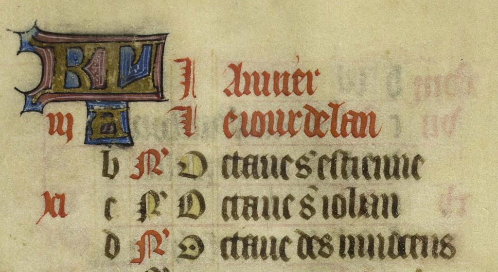
[Book of hours], 1440
When printing the Bible, Gutenberg used the Textura quadrata script, commonly used for books in churches. To make it similar to scribal handwriting, he created and used about 300 types, which included ligatures and abbreviated letters.
Examples of other scripts that were used in manuscripts and early books in medieval Europe include:
- Textura quadrata: a type of gothic script, where the black of the letters overcomes the white of the page. Used for books in churches.
- Rotunda: another type of gothic script, used in books. It was created in Bologna, in the 12th
- Bastarda: a third type of gothic script, used in documents and for formal information, such as the French and Burgundian book of hours from the 15th
- Carolingian minuscule: created in the 8th century during the governing of Charlemagne. It is the basis for the Roman type that we use today.
Examples of gothic scripts
Can you differentiate from Textura quadrata, Rotunda and Bastarda? These materials can help you if you want to try: Fonts for Latin paleography and Dawn of Western printing.
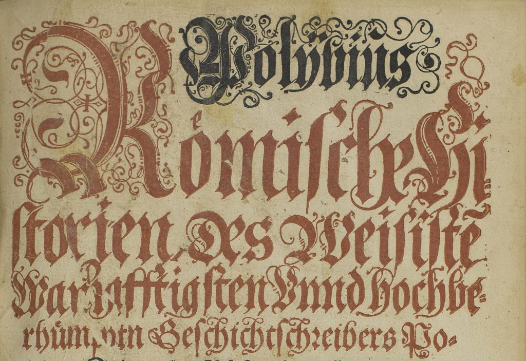
Roemische Historien, 1574
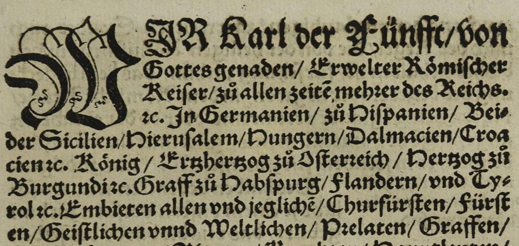
Der Römischen Kaiserlichen Maiestat Edict wider D. Martin Luther seine Anhenger Enthalter und Nachuolger…, 1546
[Catholicon], 1460
Carolingian minuscule
This script deserves its own section. The person responsible for the creation of this type of letter is not clear. Some say that Alcuin of York was the primary creator, while others say that the style actually was developed over time. But Alcuin of York’s contributions go beyond the creation of the Carolingian minuscule. He instructed scribes to use easy-to-read letters, insert spaces between words, a capital letter at the beginning of sentences, and to use punctuation on texts.
The Carolingian minuscule had clear forms and did not make use of ligatures and abbreviations, which made the information legible. The script was used for legal documents and literary works, which in turn contributed to increased communication and information comprehension.
The Carolingian minuscule, as mentioned before, gave origin to the Roman type that we still use today.
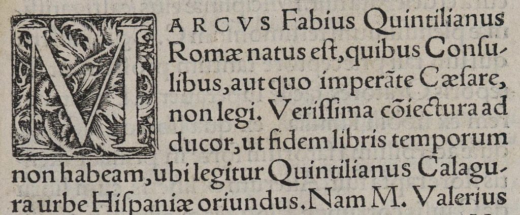
M. Fabii Quintiliani rhetoris clarrissimi Oratoriarum institutionum libri XII : opera ac studio Ioachimi…, 1543
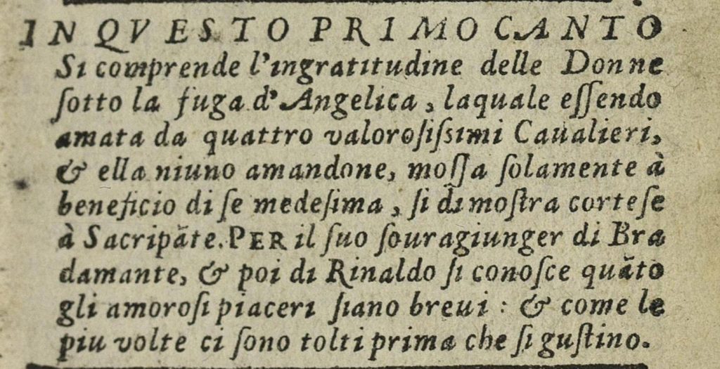
Orlando furioso, 1577
Check out our Western Manuscripts and early Printed Books to see the different scripts used and appreciate the beauty of these works.
Sources:
8th century: the Roman letterform is revived by the Carolingians (Design history)
A guide for the perplexed (Mark Bland)
Blackletter: the gothic hands 12-15th C. (Design history)


